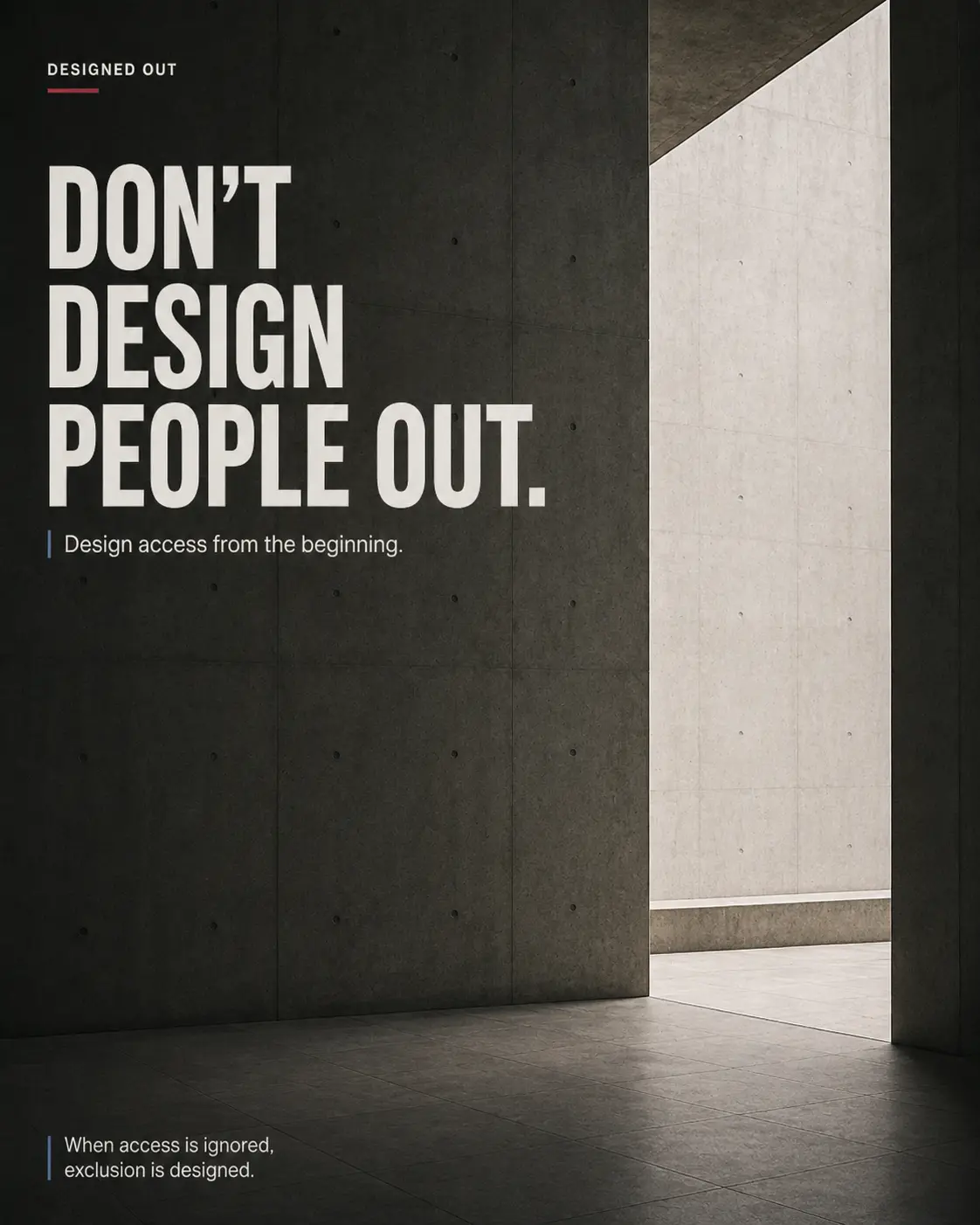
DESIGNED OUT
When access is ignored, exclusion is designed.
THE CAMPAIGN / 04
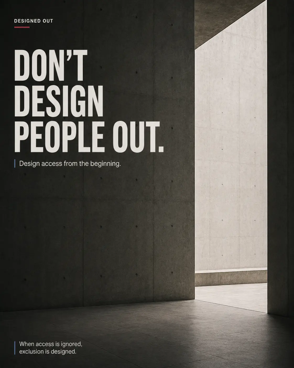
DON’T DESIGN PEOPLE OUT.
A campaign about the barriers created when accessibility is treated as an afterthought instead of a fundamental part of the design process.
THE CHALLENGE
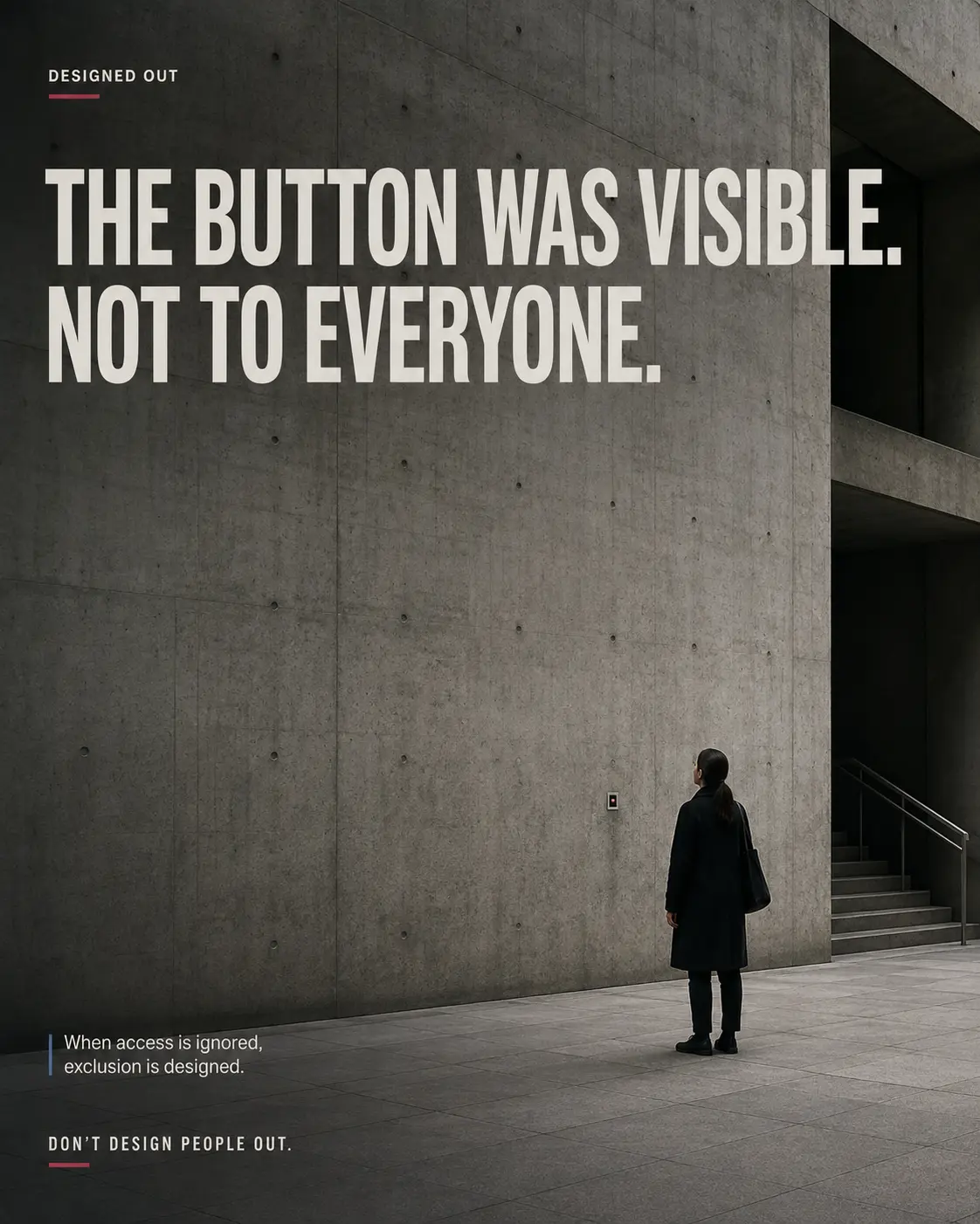
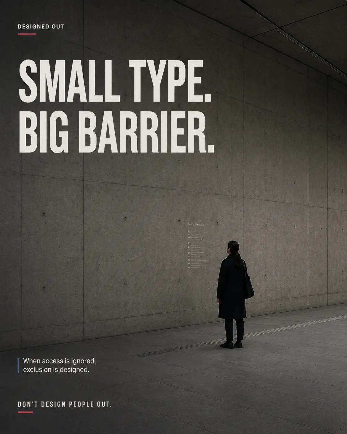
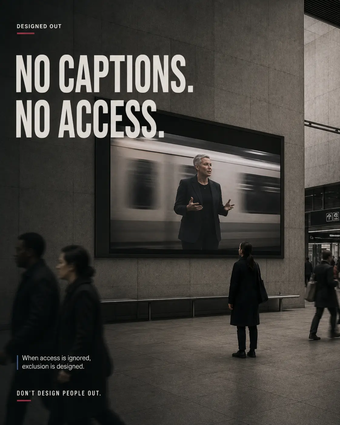
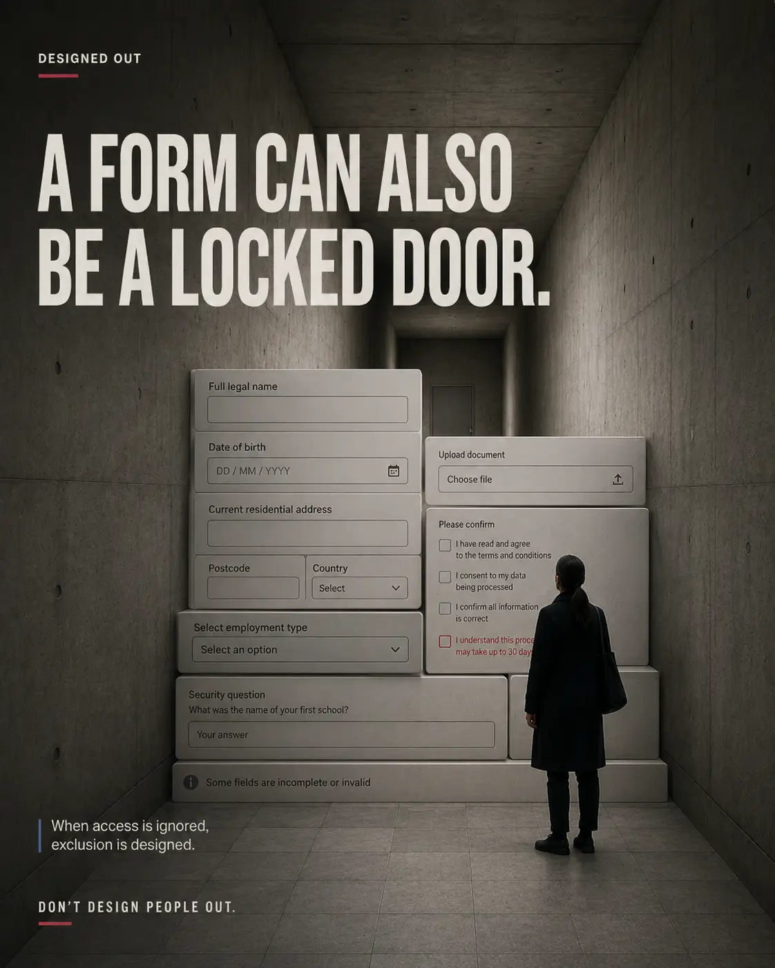
Accessibility is often reduced to a final checklist. By then, the smallest type, an unlabelled button, a silent video or an impossible form may already have turned an ordinary interaction into a barrier.
THE INSIGHT
If someone cannot see, hear, navigate or complete an experience, the problem is not the user. The exclusion was built into the system long before they arrived.
THE CREATIVE IDEA
ONE TENSION.
ONE CLEAR MOVE.
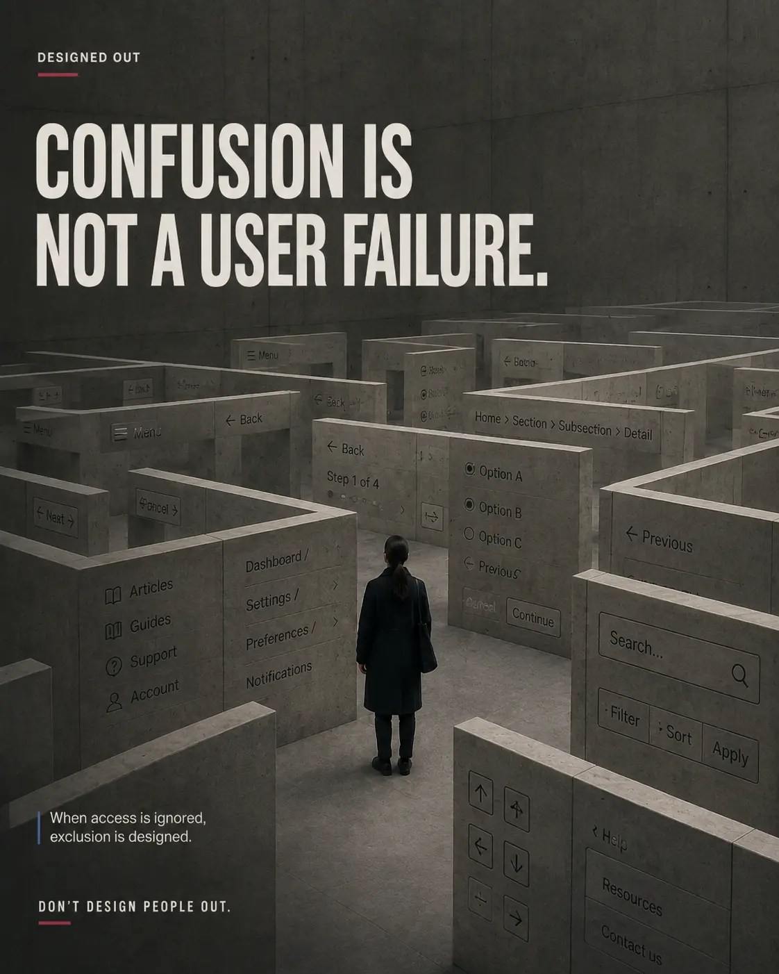
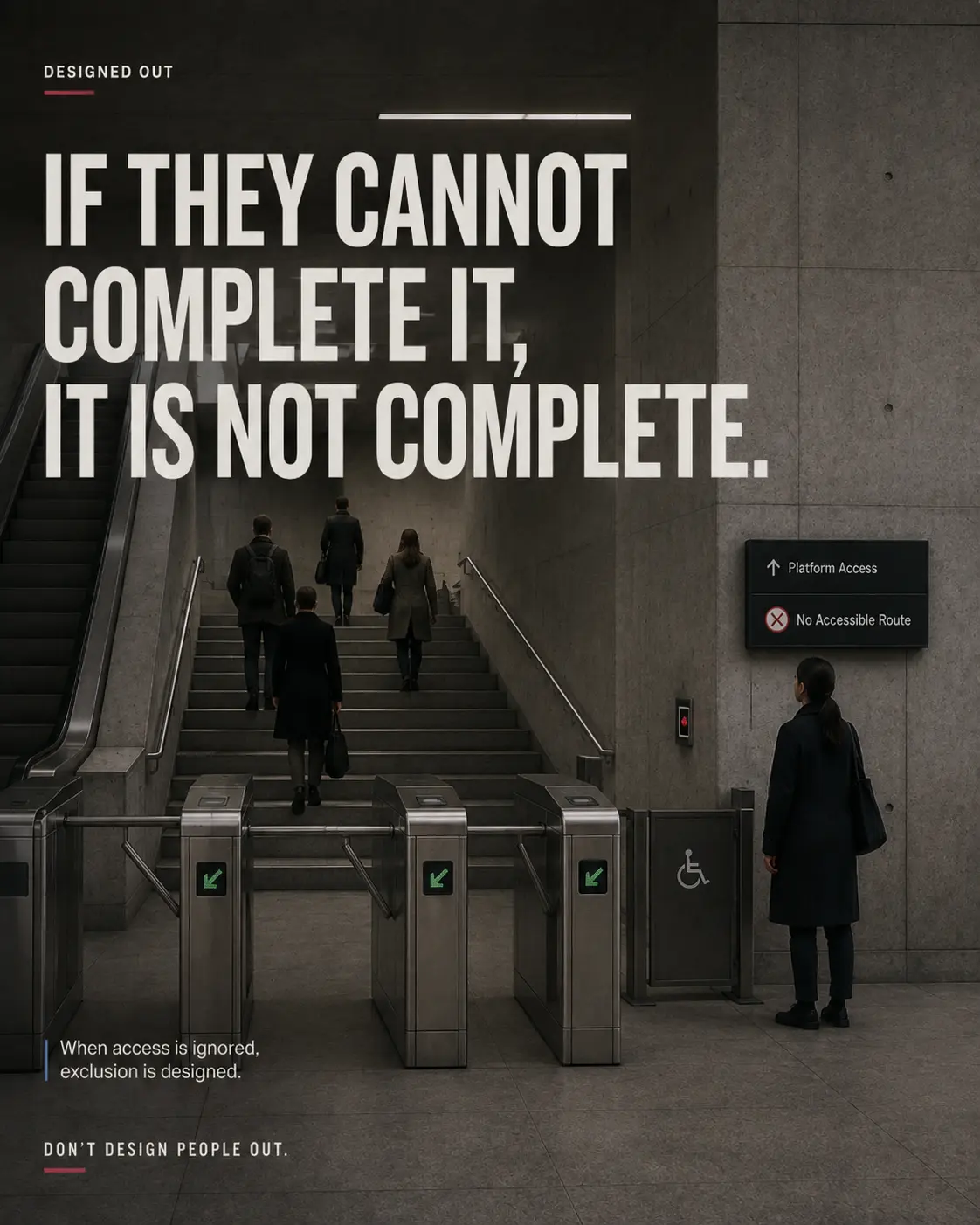
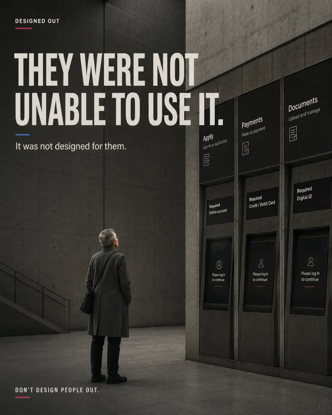
Turn familiar interface failures into monumental physical spaces. Buttons become unreachable controls, forms become locked doors and confusing navigation becomes a concrete maze. Every image makes digital exclusion impossible to dismiss as a minor detail.
CREATIVE PROCESS / 03
HOW THE IDEA
BECAME A SYSTEM.
Find the invisible barriers
Start with everyday failures in type, video, forms, controls, navigation and access.
Make exclusion physical
Translate interface friction into walls, locked doors, mazes and routes that suddenly stop.
Move responsibility to design
Replace ‘user failure’ with one clear principle: design access from the beginning.
ART DIRECTION
THE VISUAL
LANGUAGE.
Brutalist concrete architecture, low-key cinematic light and severe perspective make each barrier feel structural. Oversized condensed typography carries the accusation, while a recurring isolated figure gives the system a human scale. Blue and red signals mark access and failure.
CAMPAIGN GALLERY / 08
THE IDEA
IN THE WORLD.