UX/UI · Product
2016
Flatss UG
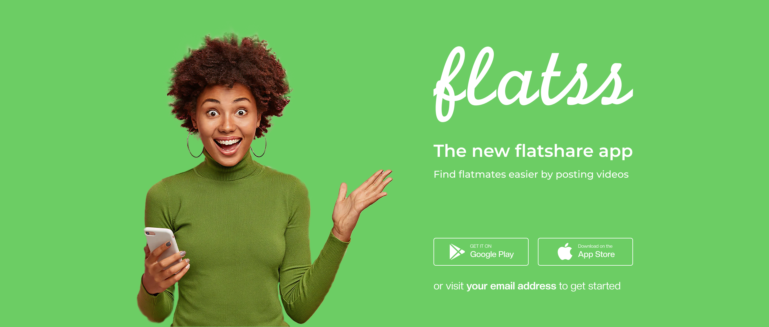
The flatshare video app—a marketplace for finding rooms, presenting available flats and meeting potential flatmates before the first visit.
Project overview
A clearer way to explore, share rooms, and connect via video.
The flatshare video app
Flatss was conceived as an app-based marketplace for shared flats and flatmate search. Unlike conventional listings, it connected main tenants or property owners with apartment seekers through video: rooms could be presented on camera and applicants could respond with their own video. The product was planned for a Berlin launch before expanding to other cities in Germany and Europe.
Better share instead of search
Finding a compatible flatmate in Berlin often means repeated visits, unanswered messages and hours spent reviewing listings that reveal very little about the people involved. The interface also needed a clearer visual system—modern buttons, icons, filters and saved searches—without obscuring the product’s core video exchange.
A video-first response
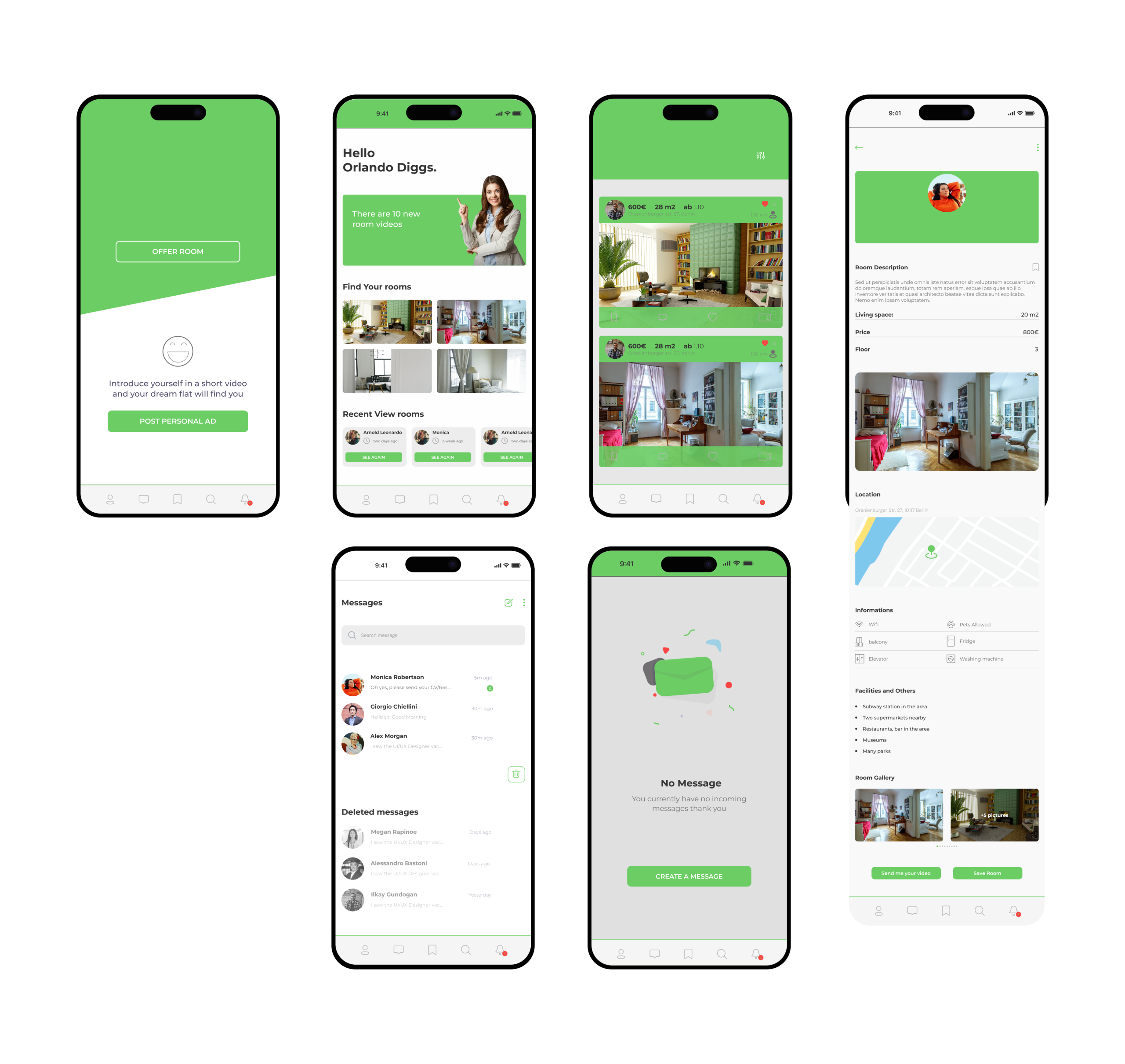
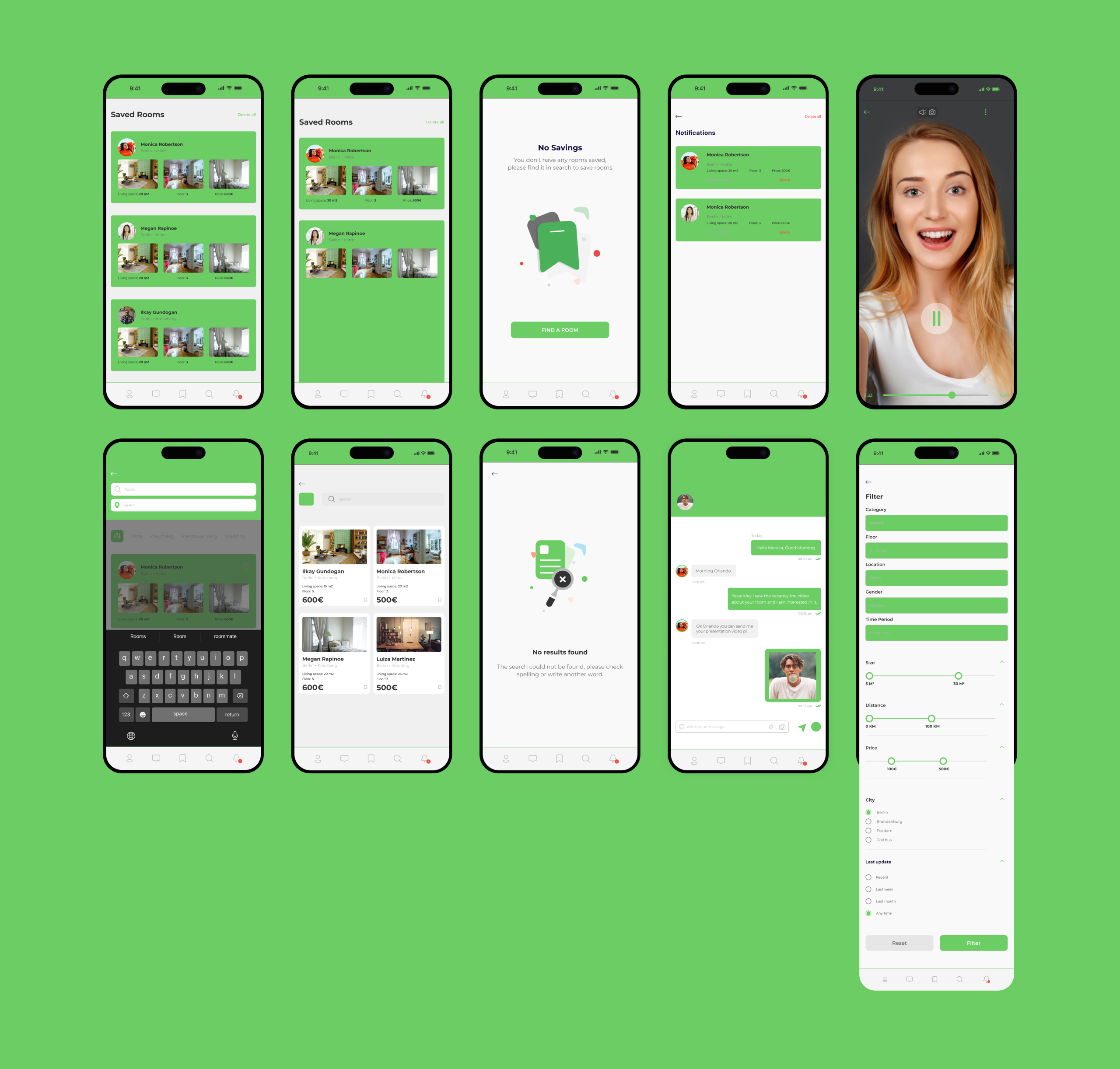
Flatss turned the search into a more personal two-sided experience. Room providers could publish a video tour, seekers could introduce themselves by video and both sides could evaluate compatibility earlier. I simplified the navigation and brought listings, filters, profiles, saved rooms and messaging into one coherent mobile interface.
Design process
Needs, workflows, up to a complete interface.
- 01
Ideation & Lo-fi Design
- Pen & Paper
- Layout & Structure
- Paper Prototype
- 02
High-fi Design
- Visual Design
- Interaction Design
- 03
Evaluation & Iteration
- Testing with Prototype
- Twisting UI Details
UX/UI Designer
An intuitive interface for a better WG experience.
- Video presentations for both rooms and applicants
- Navigation redesigned for one-handed use
- A consistent interface language across iPhone and Samsung patterns
Selected gallery
The project in detail.
User Persona
Two perspectives, one shared-flat experience.
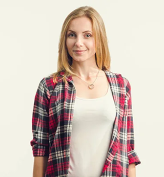
The existing audience definition focused on students, singles and couples. Julia and Thomas translate both sides of the marketplace into readable needs, behaviors and frustrations.
User profile
Julia Dashkevych
- Work
- Student at Freie Universität Berlin
- Age
- 20 years old
- Location
- Berlin
- Status
- Single
Find a shared apartment with like-minded people quickly and safely.
Digital behavior
- Uses mobile apps daily
- Trusts reviews, videos and detailed profiles
- Seeks cultural and lifestyle compatibility
Frustrations
- Outdated ads on other platforms
- Lack of response from room providers
- Difficulty forming a clear impression of potential roommates
Needs
- Watch apartment videos and meet future roommates before scheduling a visit
- Clear and quick communication with landlords
- Effective filters for price, area and roommate profile

User profile
Thomas Rodriguez
- Work
- Freelance developer
- Age
- 34 years old
- Location
- Berlin
- Status
- Single
Rent a spare room to someone responsible who has similar interests.
Digital behavior
- Uses apps when they are practical and efficient
- Values transparency and authenticity in profiles
- Prefers a video presentation before contacting someone
Frustrations
- People who do not show up for viewings
- Difficulty assessing whether a candidate will be a good fit
- Complicated posting processes on other platforms
Needs
- A simple tool for uploading apartment information and videos
- View candidates by interests, habits and compatibility
- Verified user profiles
User Flow
A clearer journey from onboarding to a video application.
The flow organizes account setup, room discovery, filtering, saved listings and profile management around the product’s central video exchange.
- Onboarding
- Log in or sign up
- Select city
- Enter or confirm location
- Home page
Find a room
- Search near you
- Set filters
- Browse findings
- Select room
- Room details
Manage account
- Open profile
- Settings
Ideation
Structure before styling.
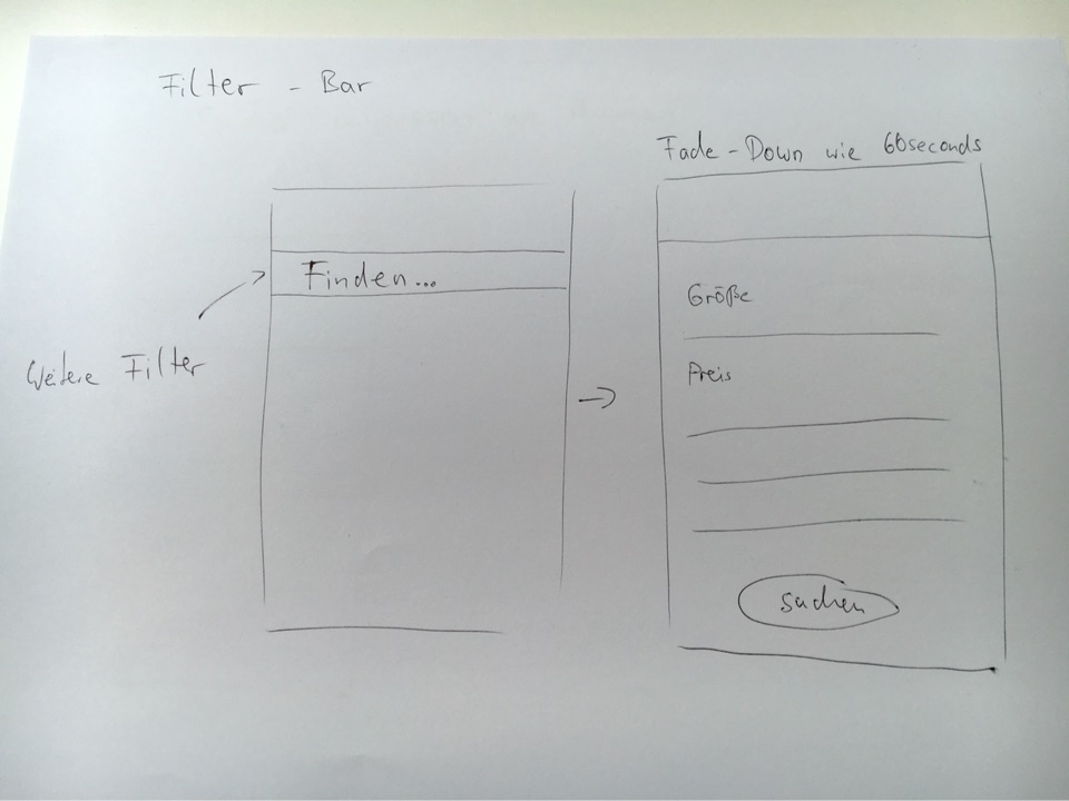
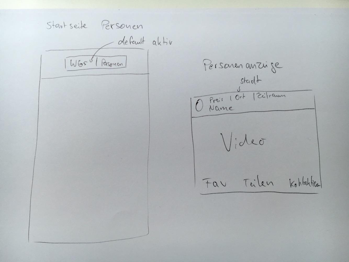
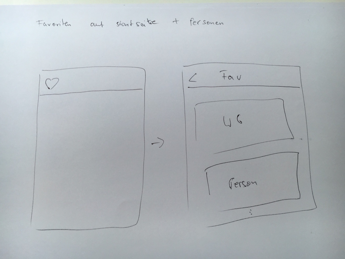
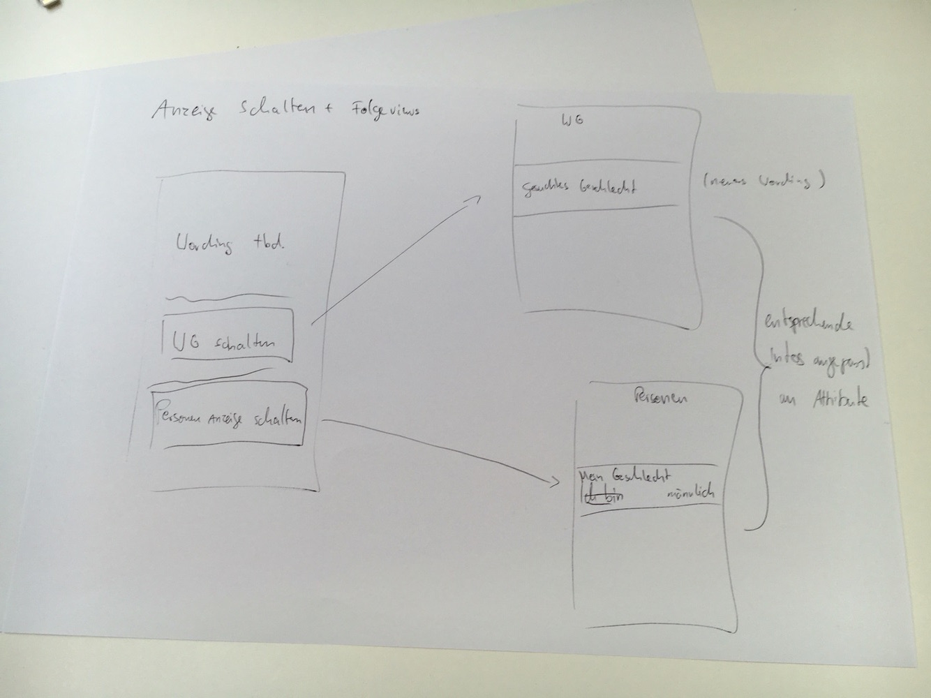
Pencil-and-paper sketches translated pain points and new flows into screen ideas. Informal heuristic feedback helped refine the direction before high-fidelity design began.

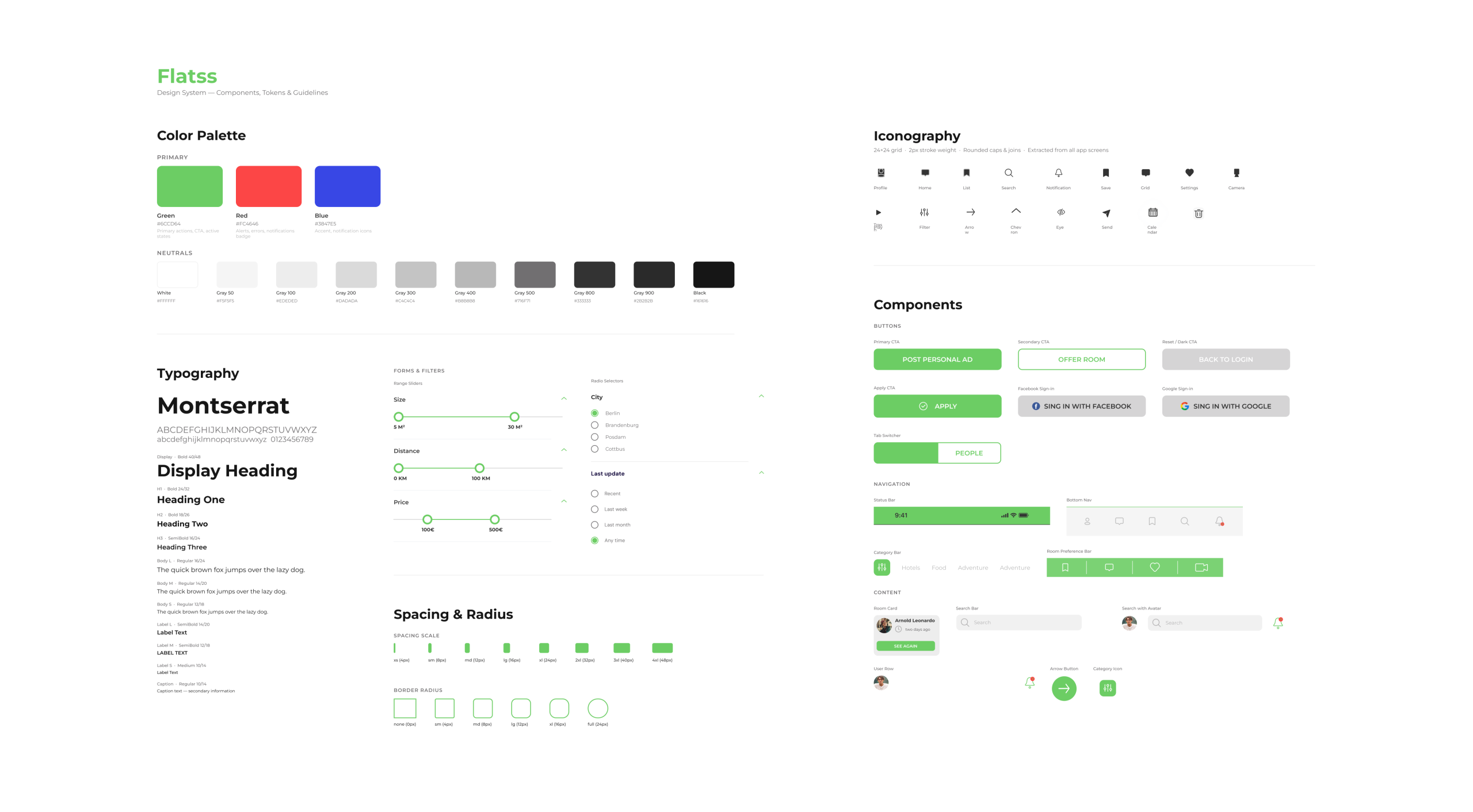
Design System
A friendly system built around recognition and consistency.
Buttons, icons, filters, saved searches, typography and color were brought into one visual language that keeps Flatss’s video-led experience easy to recognize.
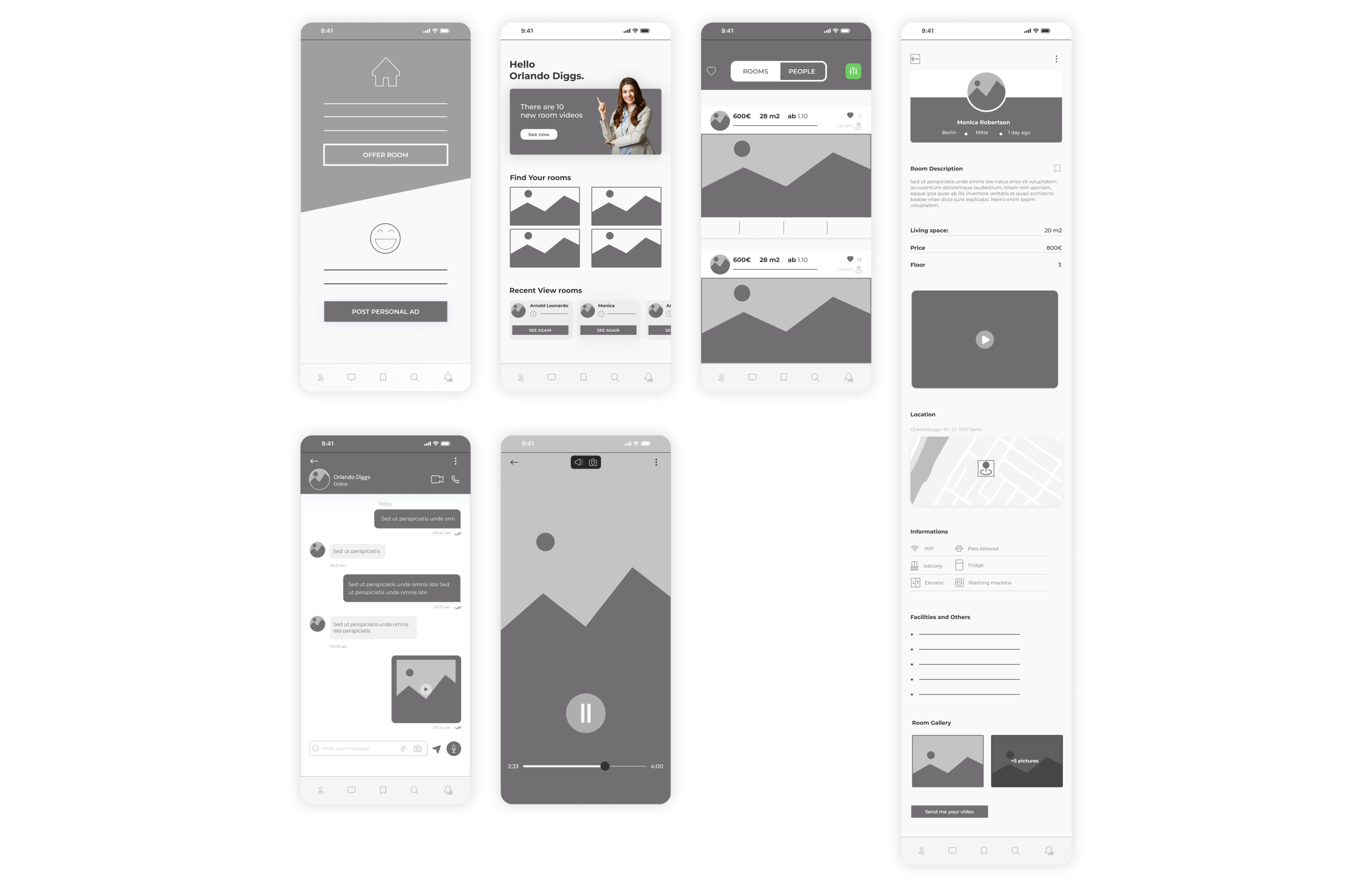
Low Fidelity
Testing hierarchy and navigation early.
The paper concepts became low-fidelity screen structures used to validate content order, navigation and the relationship between principal actions.
High Fidelity
The complete mobile experience.
The final interface focuses on how visualization and interaction support onboarding, room discovery, profiles, video-led listings and messaging across iPhone and Samsung patterns.