Brand · Identity
2020
The Big Bowl
A fresh brand identity created for an Asian restaurant in Cuba that wanted to become more distinctive and recognizable.
Project overview
A contemporary restaurant identity rooted in food, place and hospitality.
The challenge
The Cuban restaurant needed to differentiate itself with a renewed identity that felt fresh while still communicating an authentic connection to Asian culinary culture.
The response
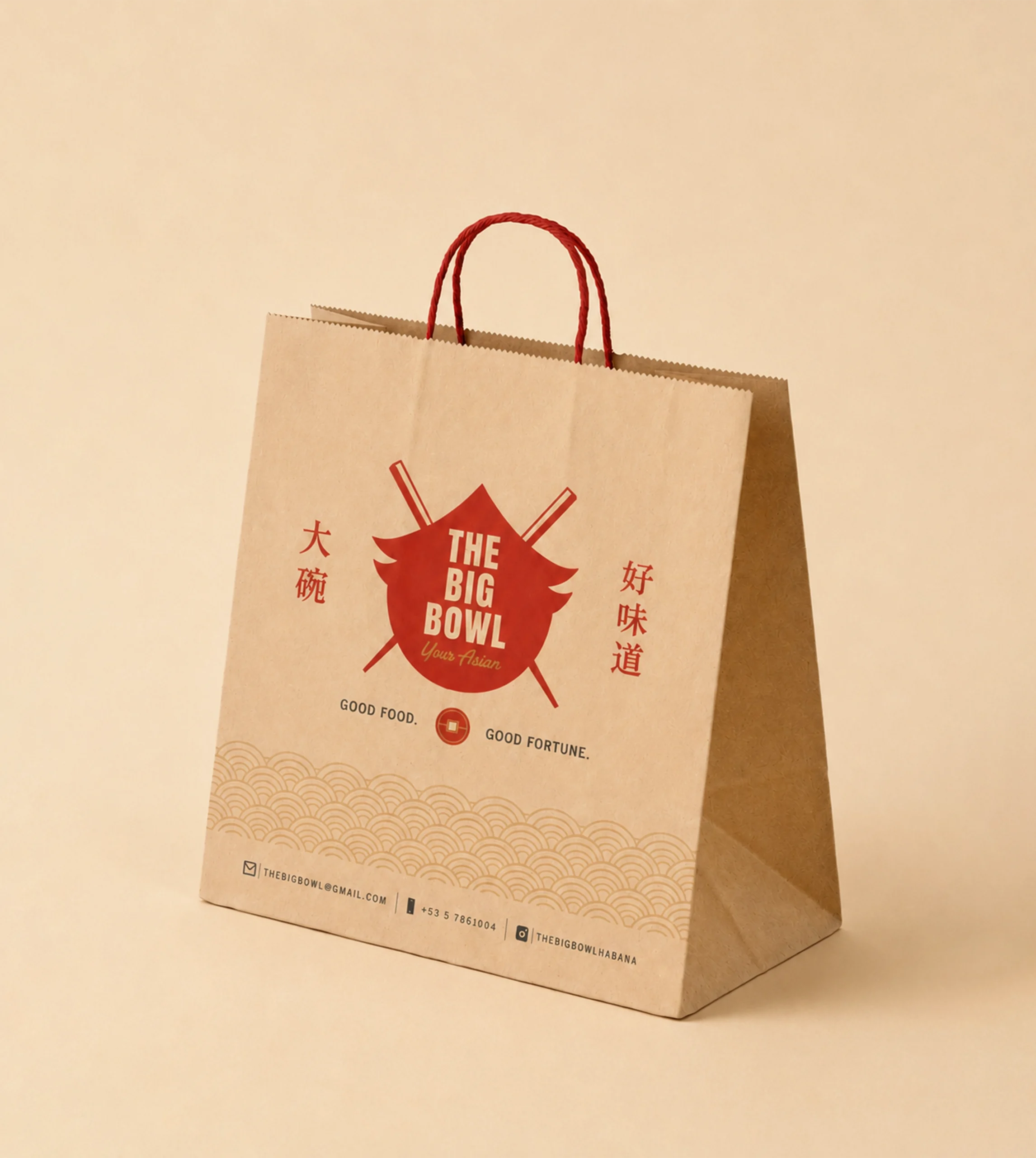
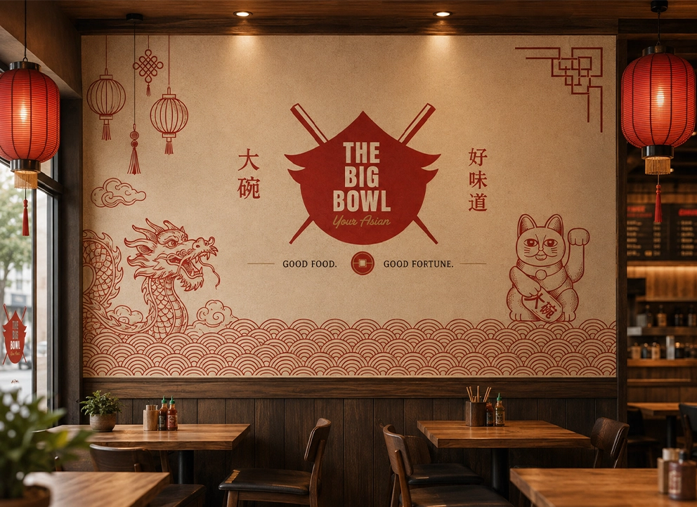
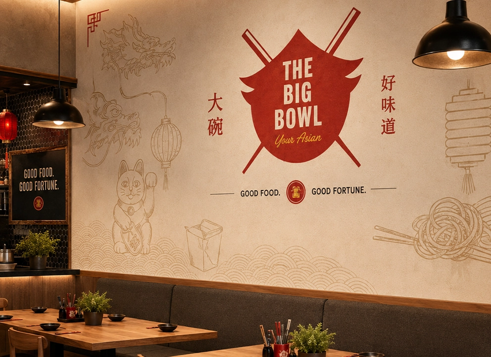
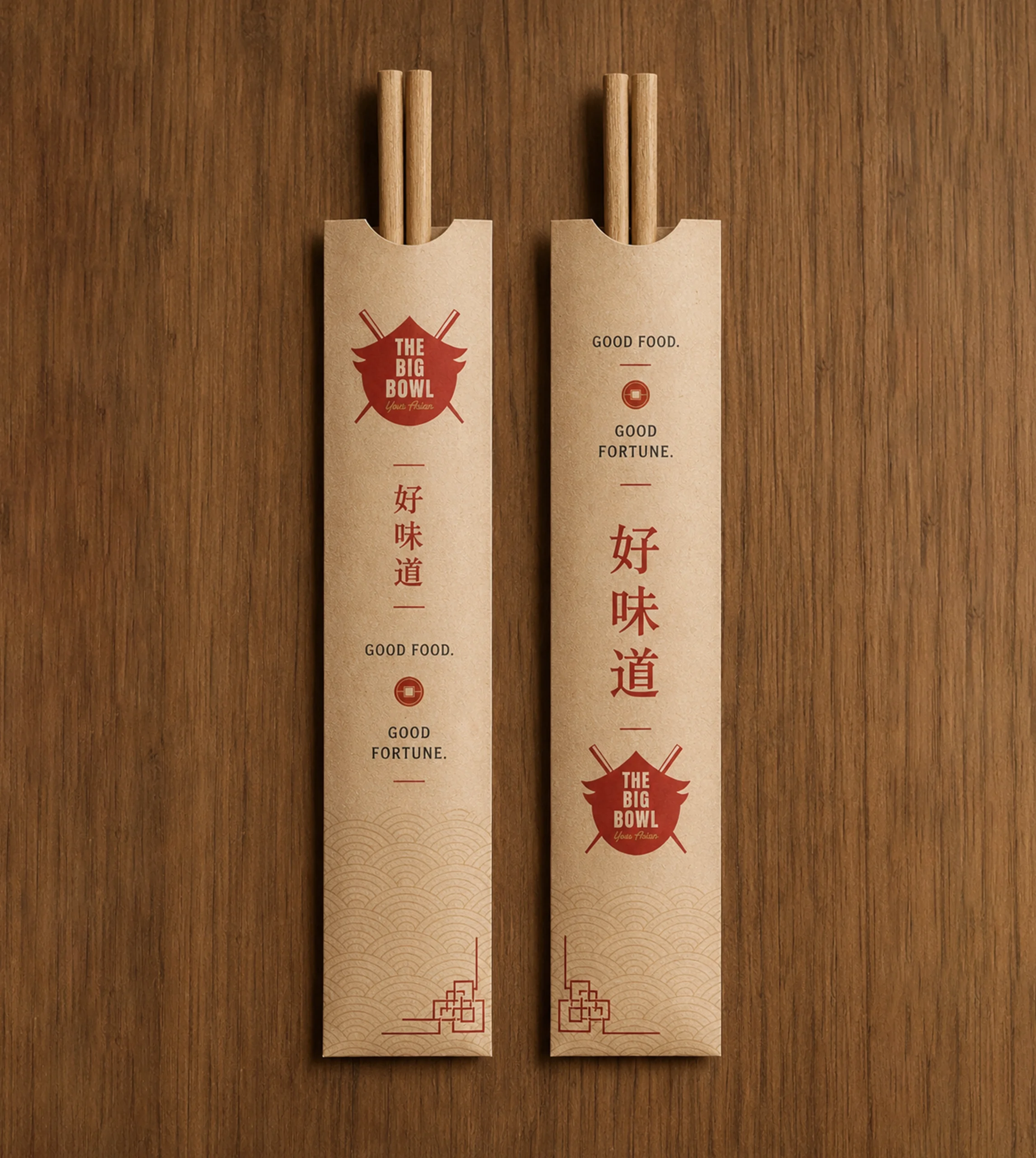
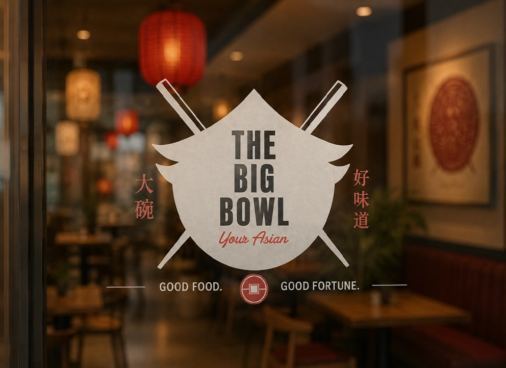
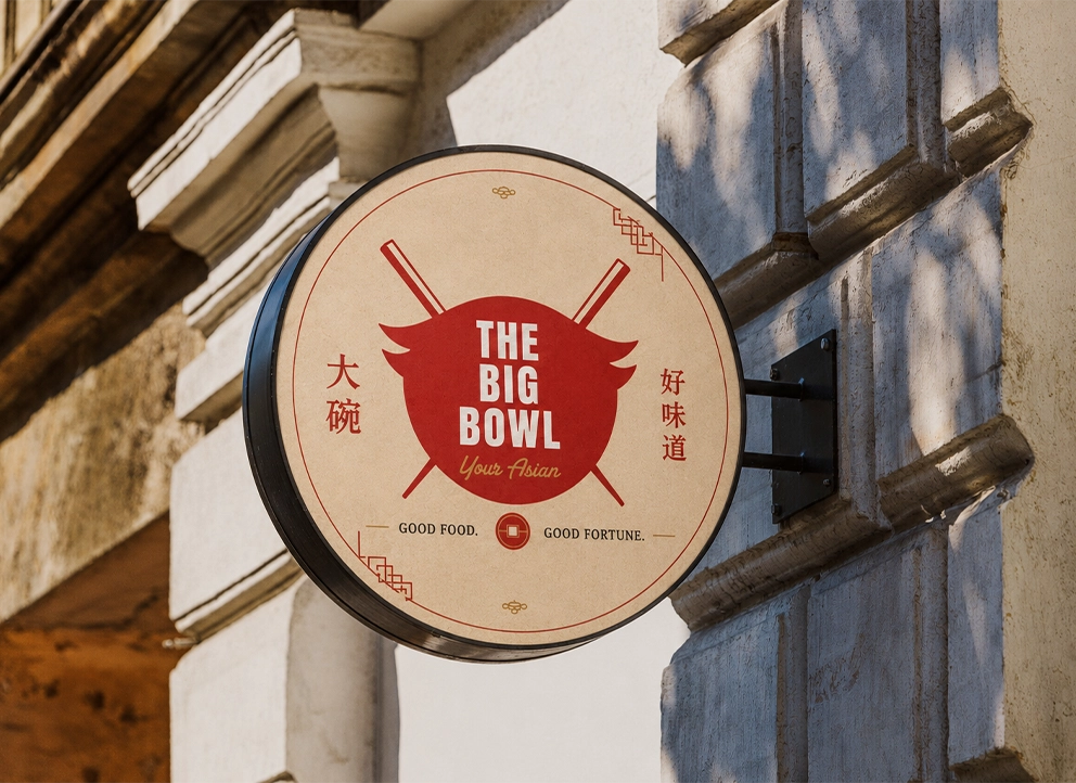
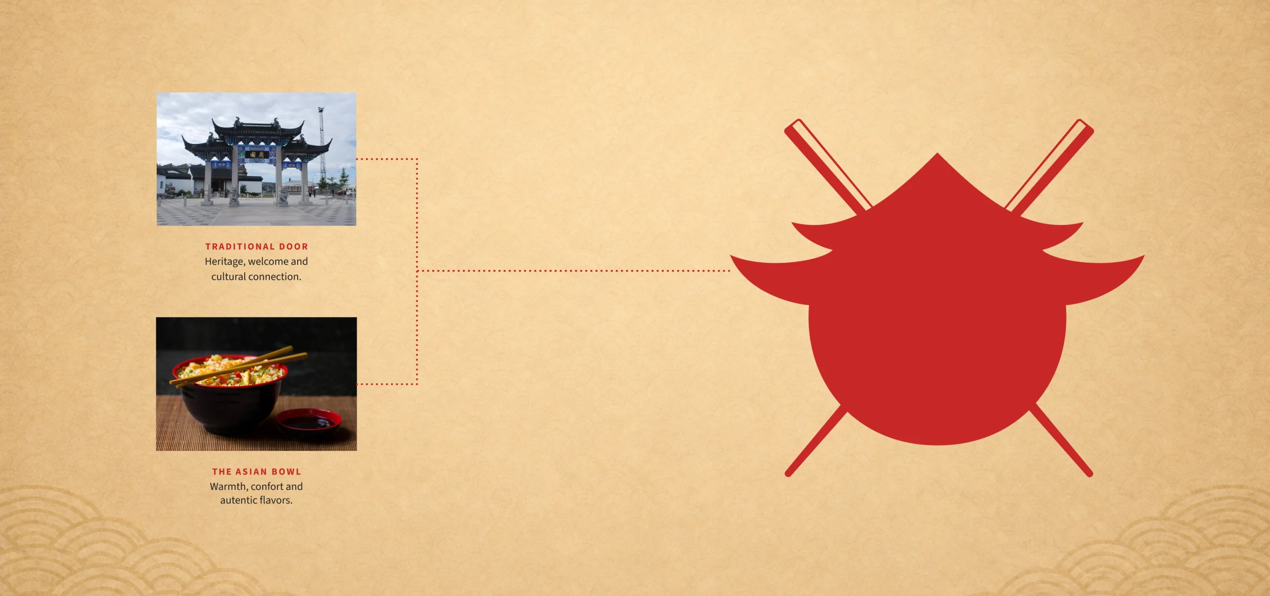
The emblem combines a bowl, a traditional doorway and chopsticks, creating a compact symbol that can move consistently across menus, signage, packaging and apparel.
Creative process
A focused view of how the work took shape.
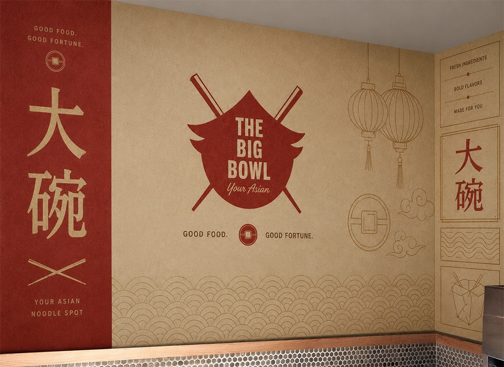
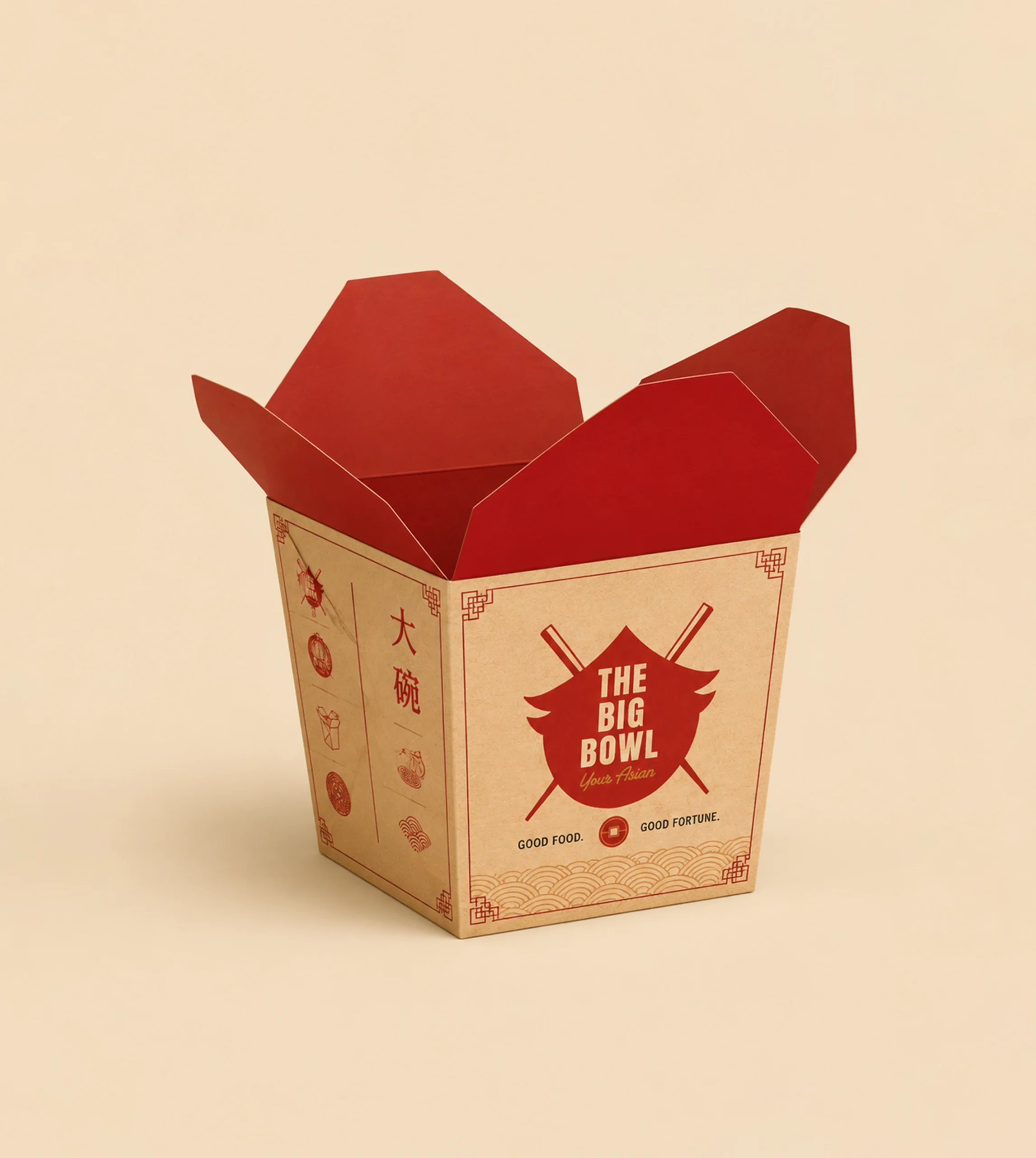
The visual system turns the logo’s architectural and culinary references into a recognizable brand world, using bold applications to connect the restaurant environment and takeaway experience.
- 01
Find the story
Hospitality, culinary tradition and the physical restaurant experience shaped the identity concept.
- 02
Build the mark
Bowl, doorway and chopsticks were simplified and combined into a contemporary emblem.
- 03
Create the system
Color, composition and logo behavior established a flexible visual language.
- 04
Apply the identity
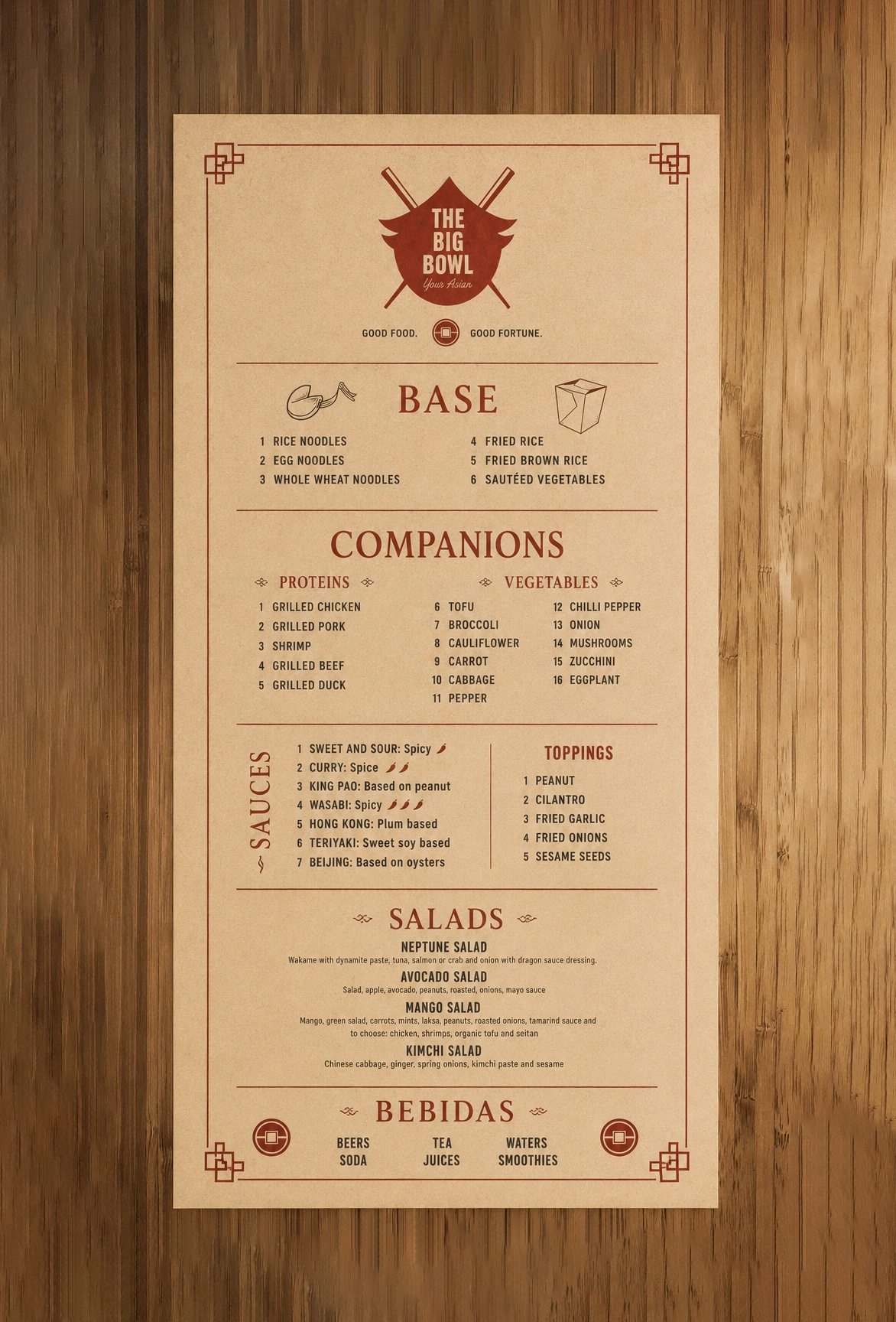
The system was extended to menus, signage, packaging, uniforms and restaurant touchpoints.
Branding
A recognizable brand system built from one memorable mark.
- A distinctive emblem combining bowl, doorway and chopstick forms
- A consistent visual language across signage, menus, packaging and apparel
- A contemporary restaurant identity rooted in hospitality and Asian culinary culture
Identity system
Branding
01 image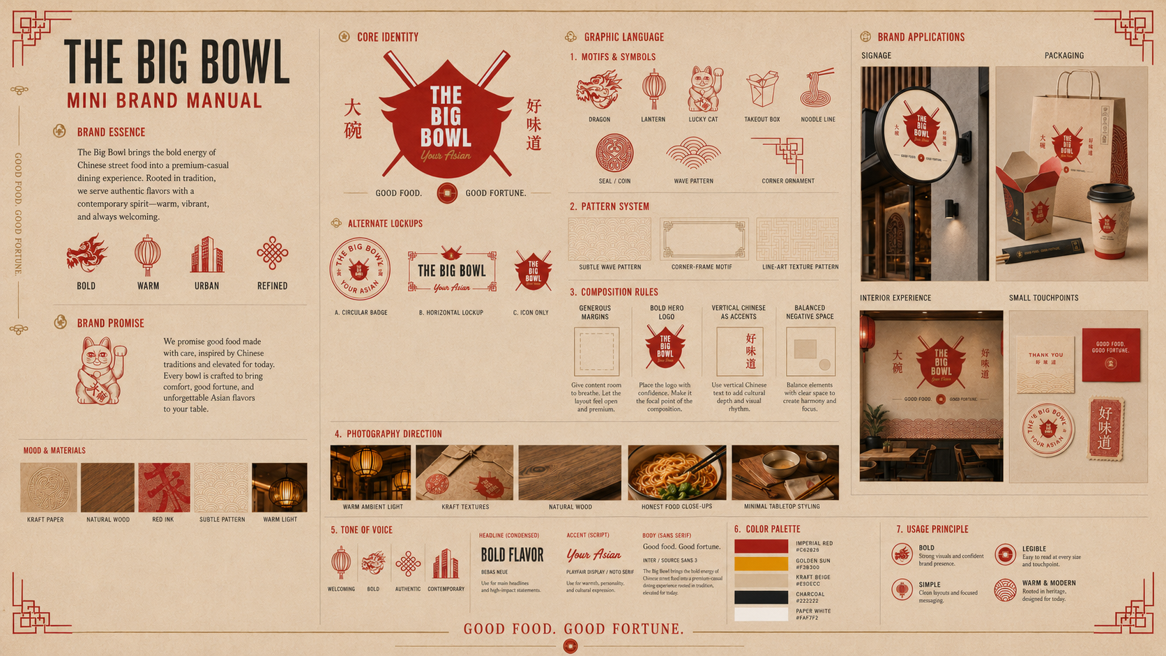
Visual identity
Logo
01 imageThe Isotype blends the warmth of an Asian bowl with the majesty of a traditional door, integrating chopsticks as a central element. This visual synthesis communicates, in a simple and powerful way, the promise of an authentic culinary experience in a space that honors Eastern tradition and culture. The result is a contemporary emblem that immediately connects with the public’s imagination, evoking both the richness of flavors and the hospitality of Asian culture.
Selected gallery
The project in detail.
09 images